
DepOrtak – A Smart Warehouse Management SaaS
Streamlining inventory and logistics for businesses through intuitive UI/UX.
Year: 2021-2024
Role: UI/UX Designer
Tools: Adobe XD, Zeplin, Figma, Adobe Illustrator, Adobe Photoshop
Project Background
How It Started
I started my journey at TIRPORT as a UI/UX intern, where I had the opportunity to work on real-world logistics and SaaS products. Over time, I transitioned into a full-time UI/UX designer, contributing to multiple projects.
One of the biggest projects born within TIRPORT was DepOrtak, a warehouse management SaaS. From the very beginning, I took ownership of the web and mobile UI design, ensuring that the platform was user-friendly, efficient, and scalable.
MVP & Early Success
DepOrtak started as an MVP (Minimum Viable Product) to test the market and validate the idea. In just two months, the product gained traction and successfully secured $1.8M in seed investment.
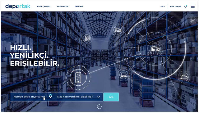
For the initial version, I designed both the web and mobile interfaces using Adobe XD, ensuring a smooth developer handoff with Zeplin. The goal was clear: create a clean, functional, and easy-to-use platform that helps businesses track, manage, and optimize their warehouse operations effortlessly. Here is one of the first prototypes of the web app I found.
Evolving the Product & Redesigning for Scale
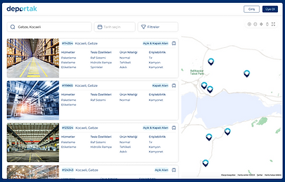
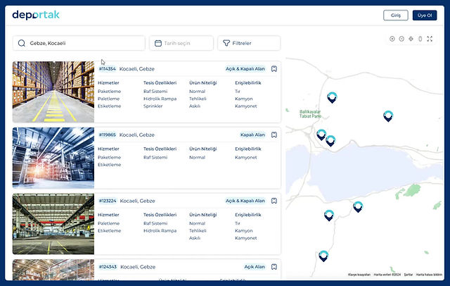
After the MVP phase, we focused on expanding DepOrtak with new features and improvements based on real user feedback. As the platform grew, it became clear that the initial design needed an overhaul to support scalability and provide a smoother experience.
At this stage, I suggested switching to Figma for a more collaborative and efficient design process. This allowed for faster iterations, better handoff, and easier feedback integration.
One major challenge was the admin panel, which had been almost unusable until this point. Managing operations required a more structured interface, so I designed a fully functional admin panel that streamlined administration tasks, making it significantly more intuitive and efficient.
The full redesign of the web app focused on a modern, clean, and highly usable interface. This not only improved navigation and workflow but also positioned DepOrtak as a polished, scalable SaaS solution ready for growth.

Evolving the Product & Redesigning for Scale
With a solid foundation in place, we shifted our focus to refining the user experience and improving performance. User feedback and analytics helped us identify pain points, allowing for targeted UX enhancements that made the platform more intuitive and efficient.
We streamlined onboarding, simplified key workflows, and optimized the mobile experience to ensure a seamless interaction across devices. These improvements not only boosted user engagement but also reduced friction in core processes, making DepOrtak more accessible to a broader audience.
Lessons Learned & Final Thoughts
Working on DepOrtak was a valuable experience that deepened my skills in UI/UX design for SaaS, product strategy, and scalable design systems. From crafting the first MVP to leading a full-scale redesign, I gained insights into designing for real-world business needs while balancing usability, functionality, and growth.
The transition to Figma, the admin panel overhaul, and the continuous UX improvements showed me the power of iteration in product design. More importantly, it reinforced my belief that good design is not just about aesthetics—it’s about problem-solving, efficiency, and creating real value for users.


